At this stage I was keen to do some visual research relating to my chosen theme, rather than of cards themselves. I came cross the work of Eric Zener & Samantha French.

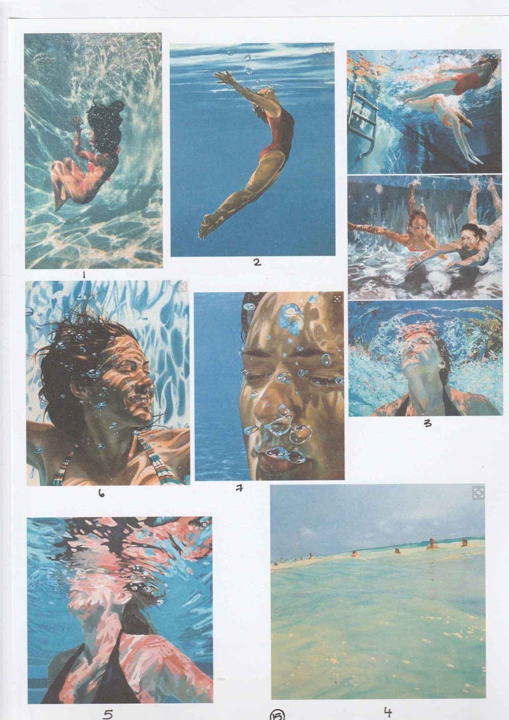
What I love about these paintings is that the figures within them seem filled with a sense of abandon. They are also filled with movement – of water and light, of gesture – in contrast to the stillness that the property of water imposes when one is beneath it. It’s as if time is not only frozen by the the artist’s eye, but by the water itself.
I would love to capture the mood that these paintings convey, perhaps with a figure diving into water. However, I know I am lacking the artistic skills needed to make what I see inside my head. I can perhaps try to capture it in another way.
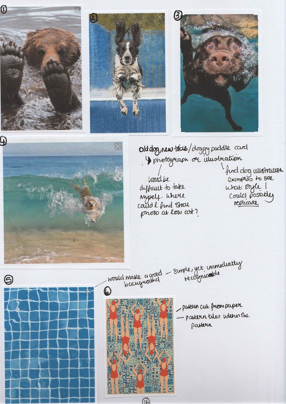
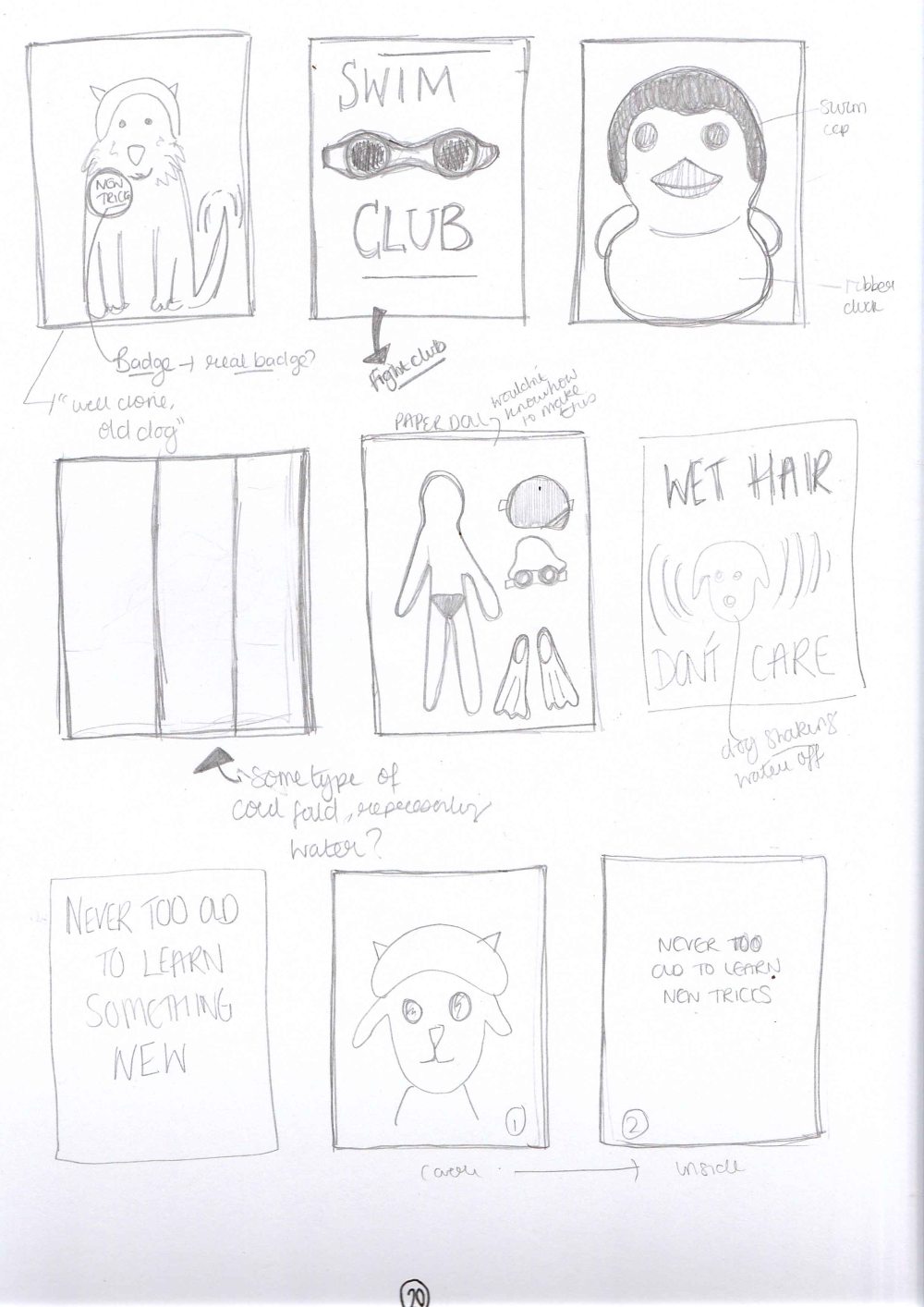
As you can see in my sketchbook, I had the idea of teaching an old dog new tricks in my mind for a while, and collected some more images. I also collected some images of illustrations related to swimming and water. Pinterest Board Link.
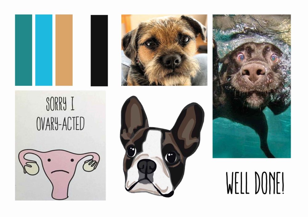
I did not feel ready at this stage to create a mood board and mock up. So I did some quick thumbnails to do some thinking with drawings instead of words, and this really helped to loosen me up a little. I had started to feel as though I was thinking too hard about things, and this was making it tricky to think of ideas. Once I did these thumbnails I made a mood board for myself (rather than a crit) and further refined the research I would like to do.
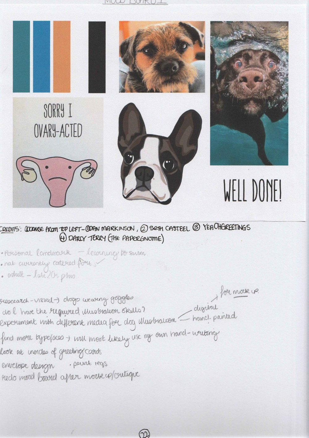
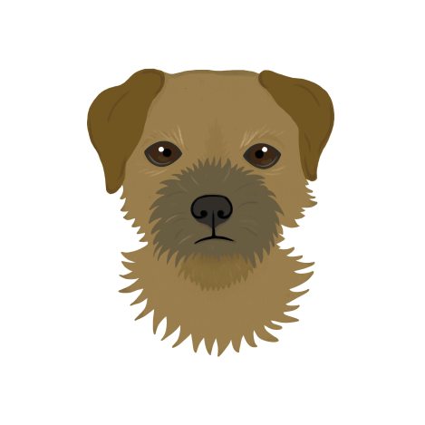
I did some visual research on dog illustrations and found some images of dogs for inspiration. I decided that I would like to illustrate a boarder terrier, as they have an old man quality about them that suits the theme
I also made the decision at this point to make 3 cards related to learning to swim.
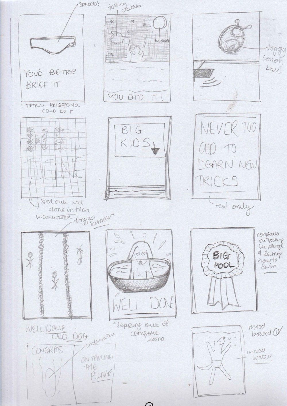
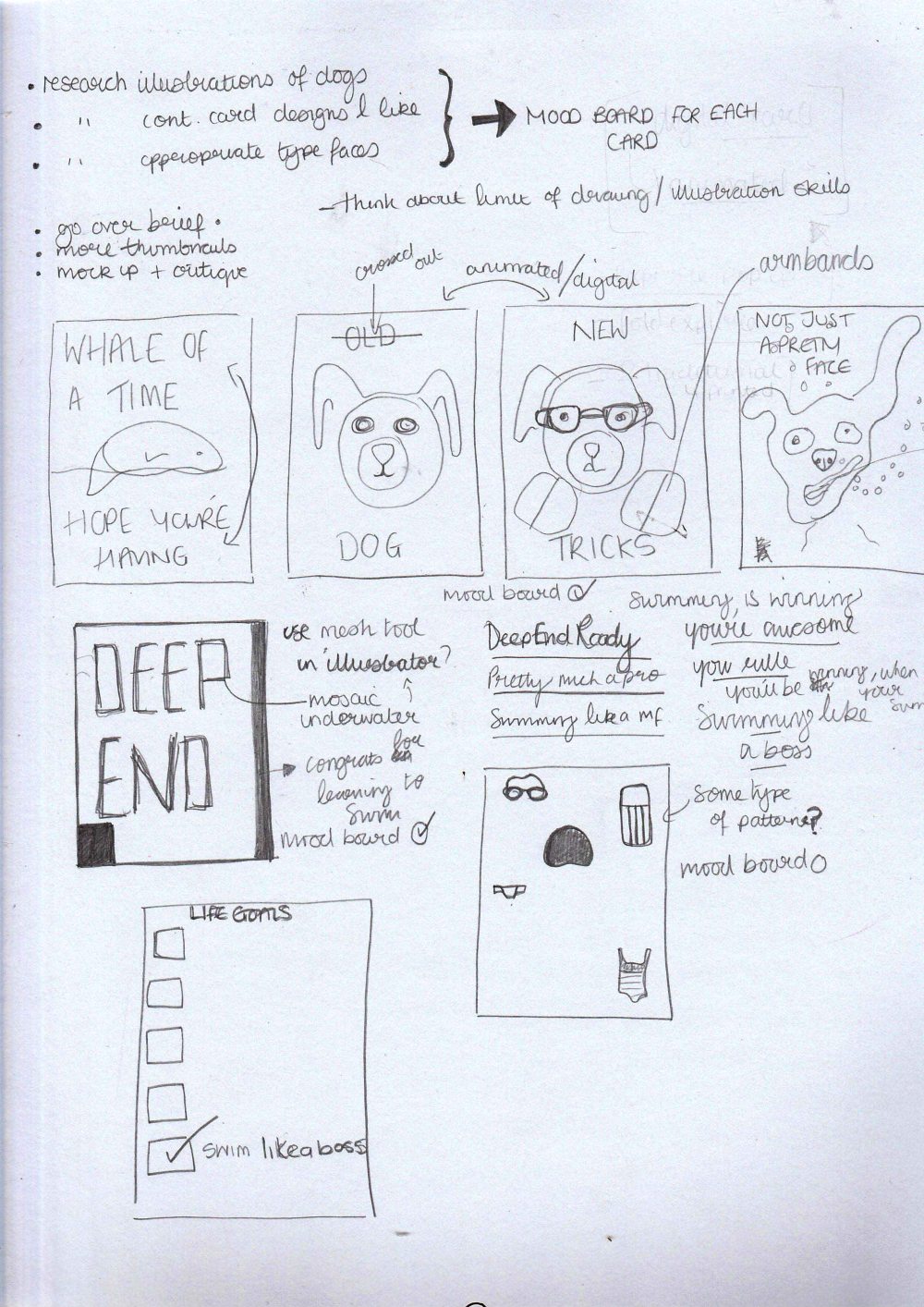
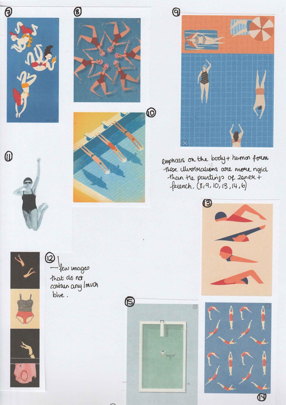
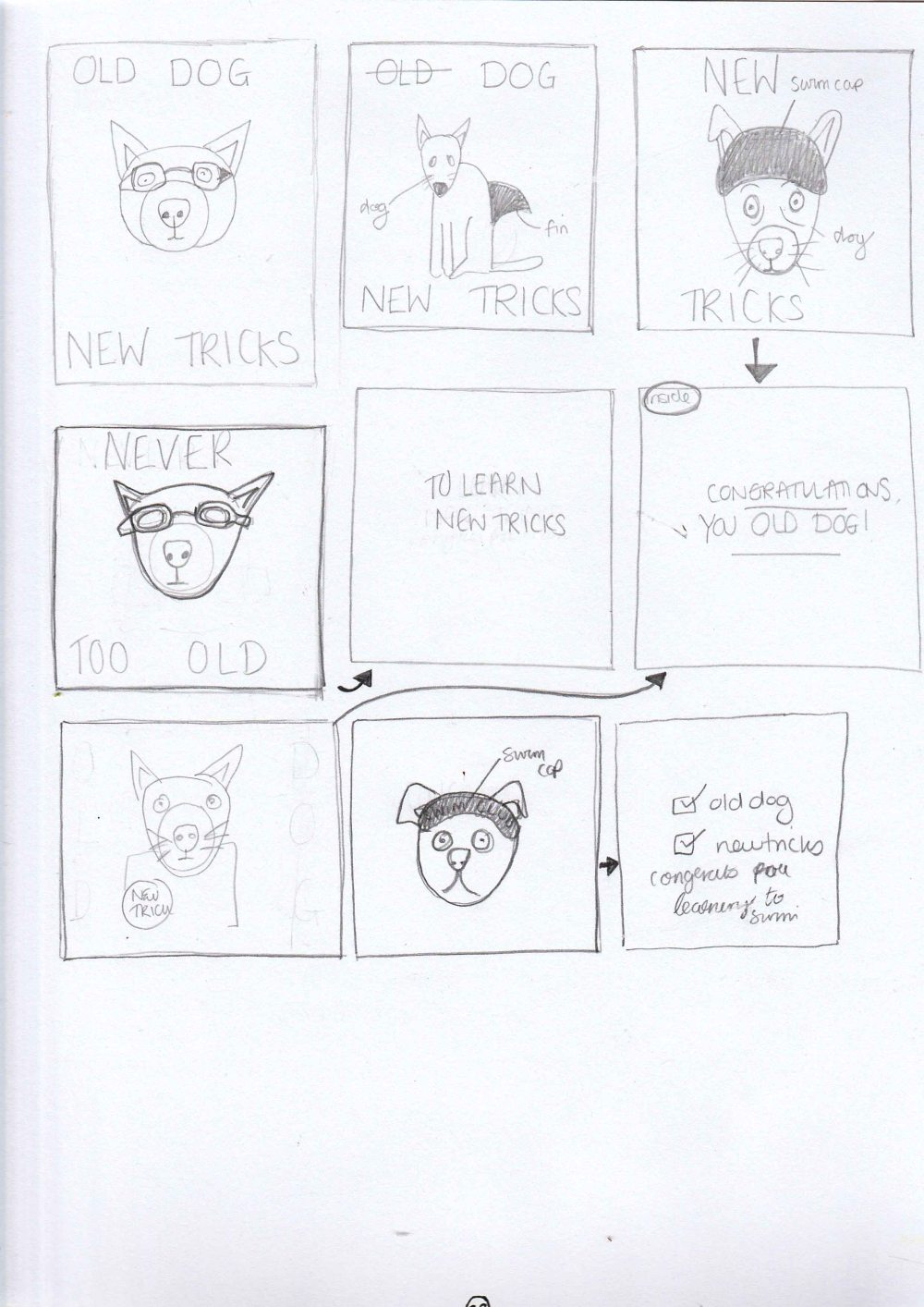
Now that I had an idea of the visual style I was looking for I did some more thumbnails.
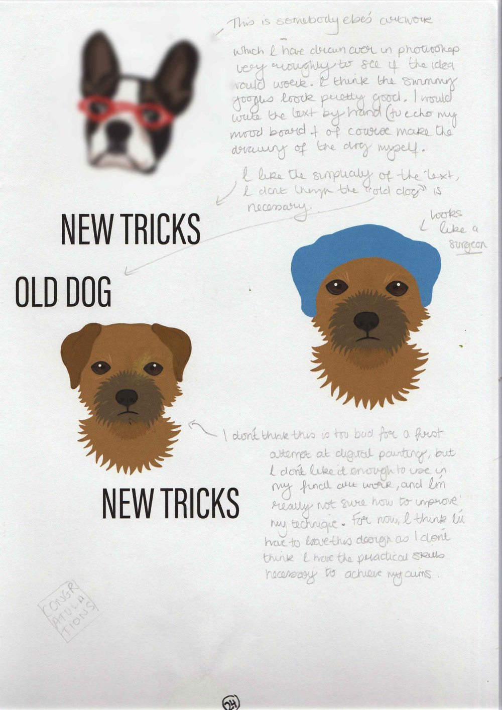
I once again found myself deviating a little from the advised steps. I could at this stage have presented a mood board and mock up for critique. However, I know that I am still pretty bad at doing rough drawings. I had found the work of an illustrator online who’s digital drawing of dogs was perfect for the design I had in my mind. However, I had no idea if I was capable of producing work in a similar style as I have never used photoshop to draw/paint before. I therefore took some time to play around on photoshop to see if I could paint a dog. The results can be seen below. I was incredibly disheartened by these attempts and fretting over my lack of skills was throwing me off course. I moved on to designing the second and third cards and then came back to this design a week or so later.
After a break, my illustrations did not look so bad, though I still wasn’t too pleased with my attempts to add a swimming cap and googles.
I briefly contemplated using some royalty free vectors, instead of my own art work. I took one of these into illustrator and added some shading effects. The results were not too bad and I think this could be an option to bear in mind for future projects.


In the end I decided to modify somebody else’s illustration (the one from my mood board) for the purposes of the crit. You can see this illustration below, though it has been blurred for copyright reasons.
CRITIQUE
BRIEF
Create a greeting card for a sentiment or event that is worthy of a greeting card but not catered for by card manufacturers
MOOD BOARD
MOCK UPS


RATIONALE
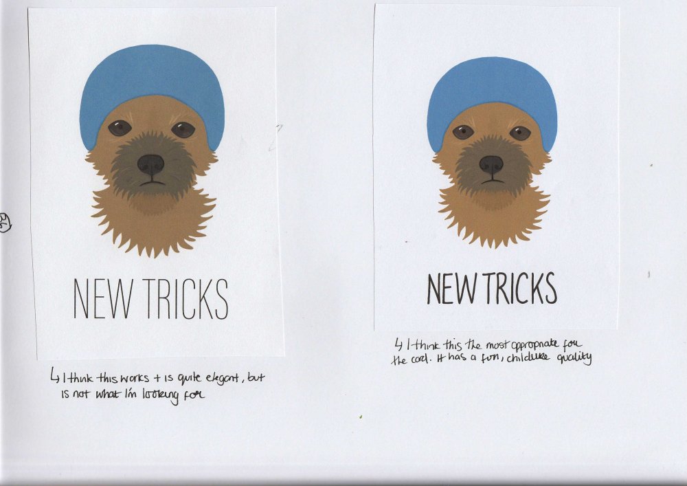
This card is to congratulate an adult on learning to swim later in life. It would be suitable for a person of any sex, and any (adult) age, however, the style of card is quite modern, youthful and fun, so would perhaps be most popular with those aged under age the age of 45.
CRIT FEEDBACK
- cute
- fun
- not clear what exactly the card is for
- what does the card say inside?
- The letters look very “intense”
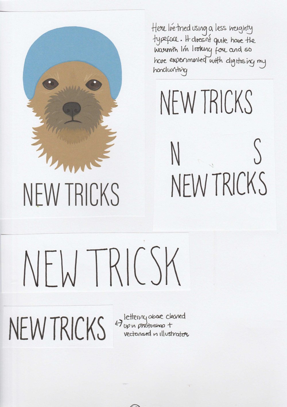
Following the mainly positive feedback from family and friends, my goals were to add some type of swimming paraphernalia to the dog illustration, figure out the message inside of the card and find a new typeface.


I still wanted a tall sans serfif, so I tried using other styles in the Acumin pro family. I thought this looked okay, but did not have the warmth I was looking for. I wanted to card to look a little hand made, so experimented with digitising my own handwriting. I looked back at the phrases I had thought of and chose ‘You can swim! Well done, you old dog’. I found that tracing over the same typeface with a pen was a good way to produce neat letters and spacing. I then adjusted things in photoshop and vectorised in illustrator.
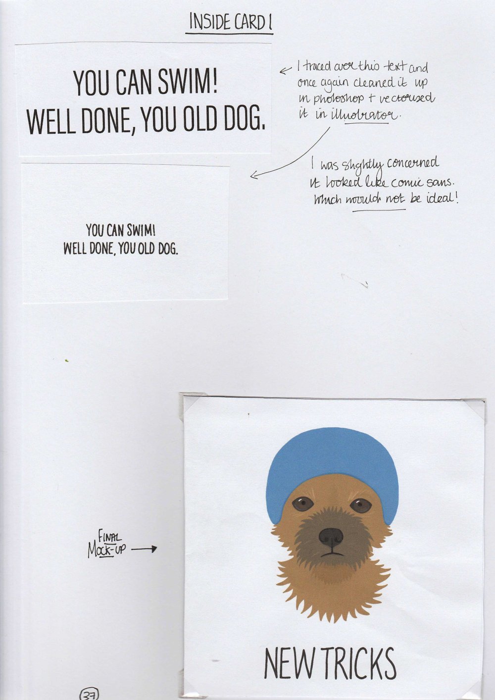
I printed a mock up to scale so that I could see what the card looked like before sending it to the printers.
(click the images below
to enlarge)